ShopDreamUp AI ArtDreamUp
Deviation Actions


Suggested Deviants


Suggested Collections


You Might Like…


Featured in Groups


Description
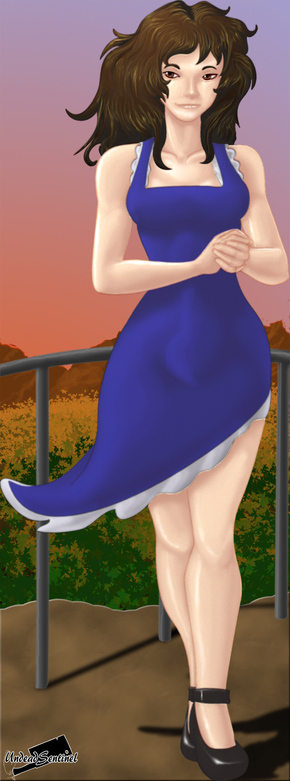
Here we have a little contest entry for  , which was also featured in my live stream!
This is the fruit of my labor, bask in the culmination of all my research thus far, using only 34 layers of techniques.
Enjoy the art guys.
Tash is a copyright character of
Art was crafted by me.
, which was also featured in my live stream!This is the fruit of my labor, bask in the culmination of all my research thus far, using only 34 layers of techniques.
Enjoy the art guys.
Tash is a copyright character of
Art was crafted by me.
Image size
595x1600px 559.55 KB
© 2012 - 2024 UndeadSentinel
Comments20
Join the community to add your comment. Already a deviant? Log In
MiaSueZepp pointed out most of what you should keep in mind, but the thing that bothered me is the dress to the body. The body is nicely detailed and shaded, but the dress just looks like it's been pasted it on with little shading. Though, i do see you tried to put some there. I suggest drawing wrinkles and lines with a darker brush to help surface some detail, shading will be a little easier that way and not so plain. The background, is a nice touch. The sunset and the mountains. But the problem with using a photoshop brush for one thing, is sometimes it's unclear what it's supposed to me. I'm guessing a foresty thing? But at first it looked like a big bush. Nice touch with the shadow.
The area with her knee is a little odd. if you look at the one closest to the shadow, right above the knee is a little to thin. Nice work on the fingers and hair. c: Nice job on the lips as well. though they're a little wide; a face is lined up in sections. the end of our lips end around the start or (closely around) of the eyes. then the nose is plopped in the middle. c:
Also one last thing I wanted to point out, there's no dark and light source. it's straight daylight which wouldn't be completely realistic when there's a sunset. It would mean everything is turning darker, and that the girl would probably stand out more by the reflection of the sunset.